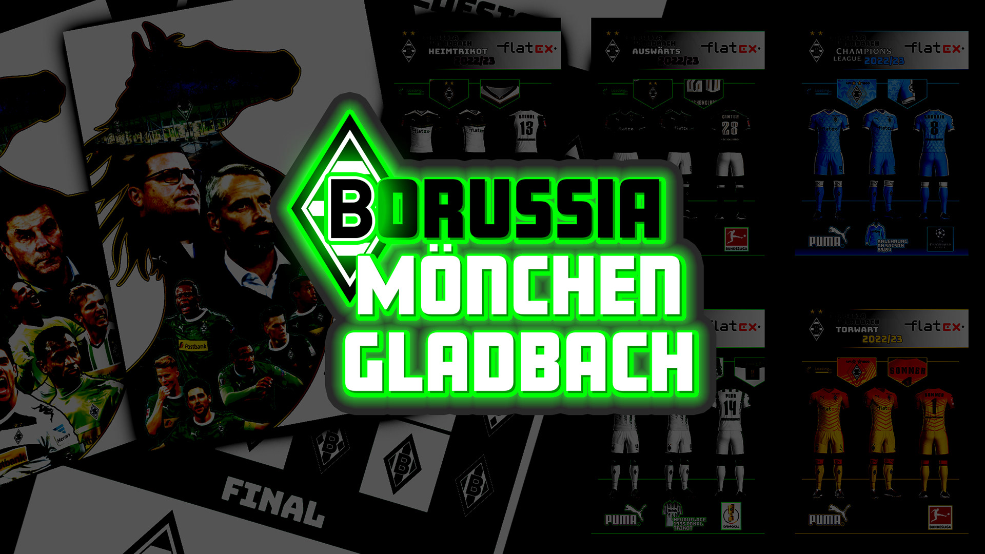
"Borussia VfL 1900 Mönchengladbach" is a professional football club playing in the top flight of German football, the Bundesliga. This Portfolio is a compendium of design concepts for the club.


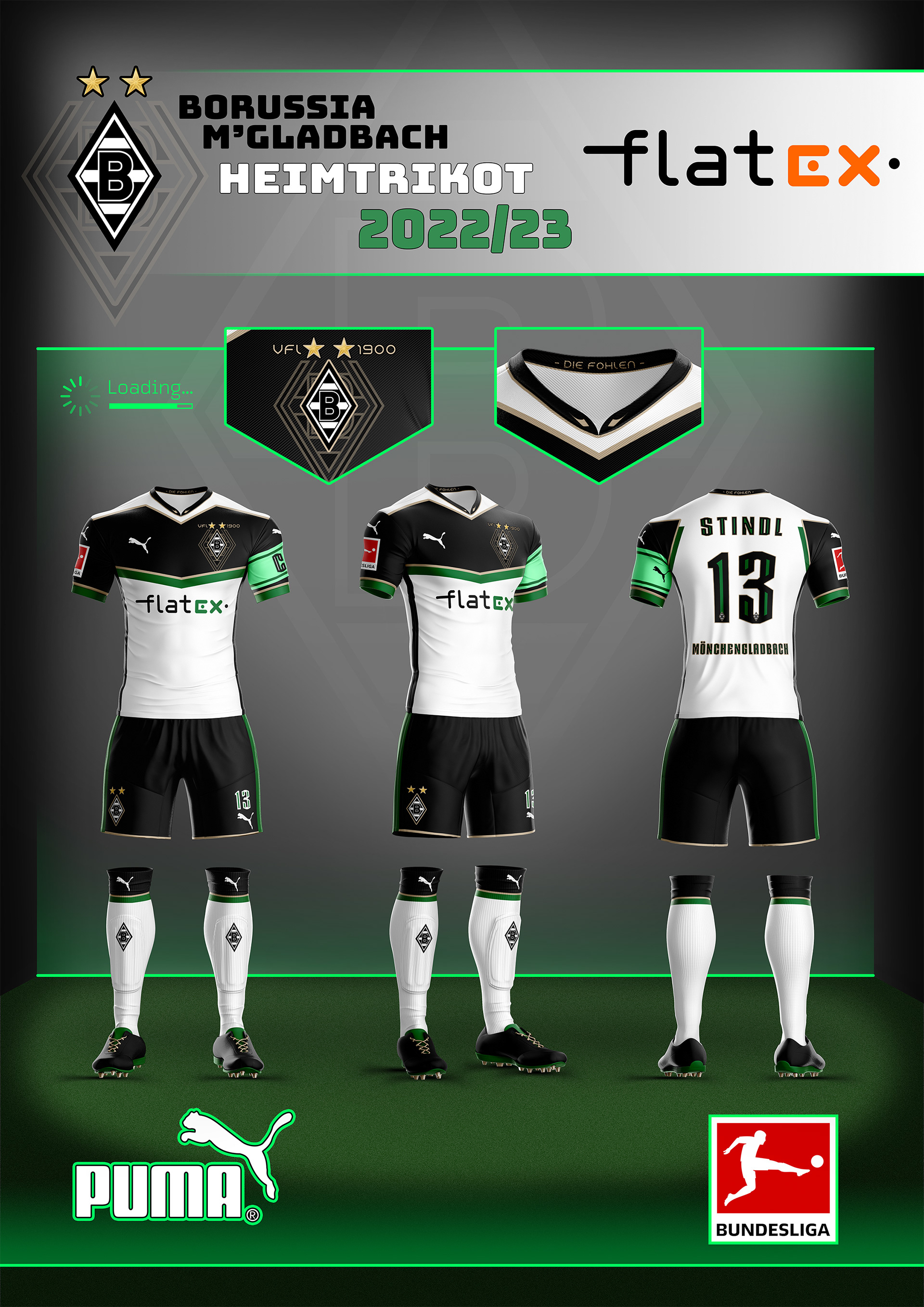
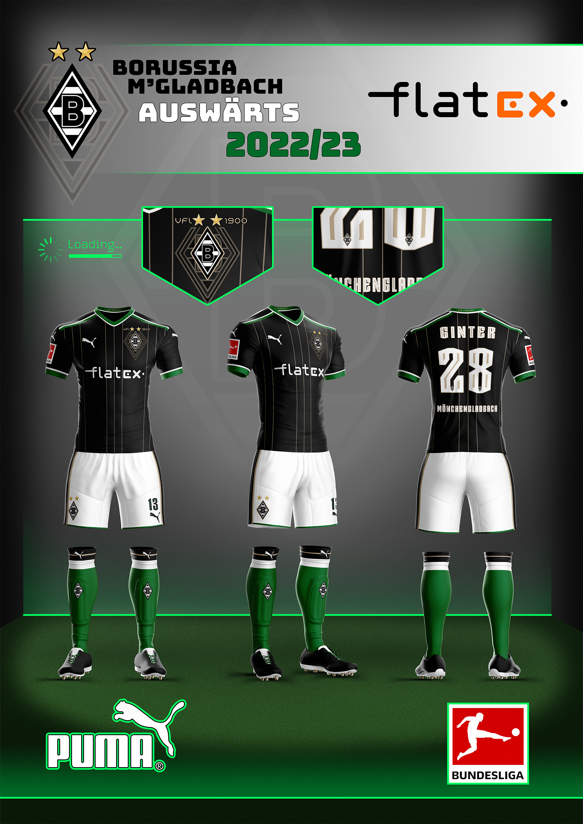
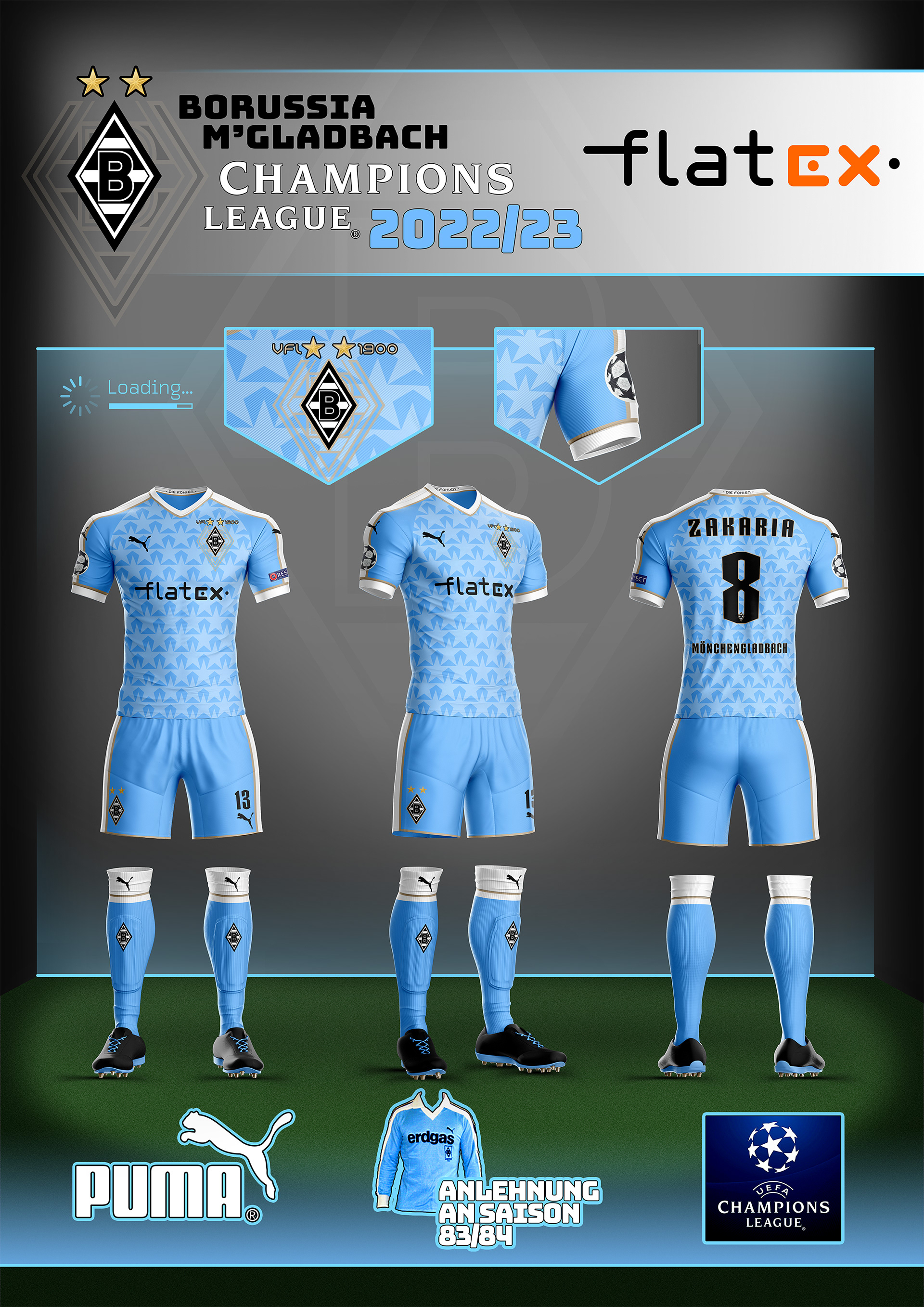
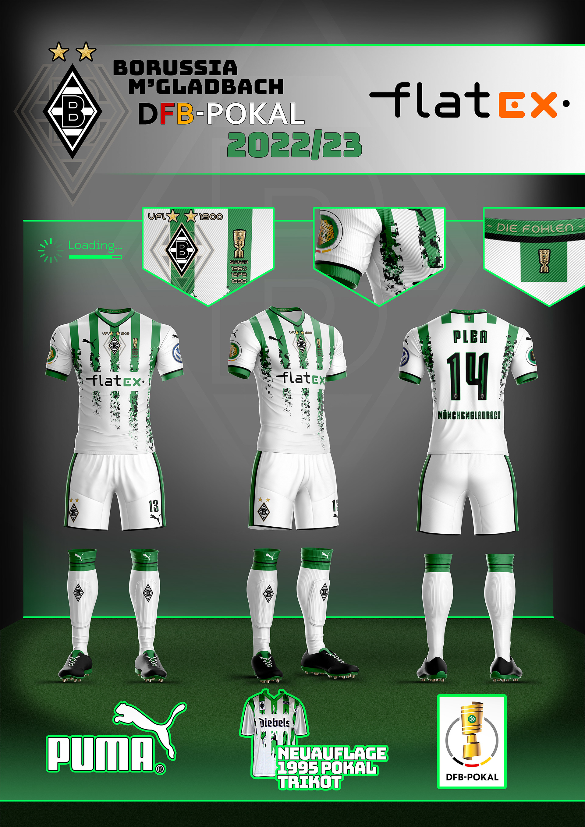
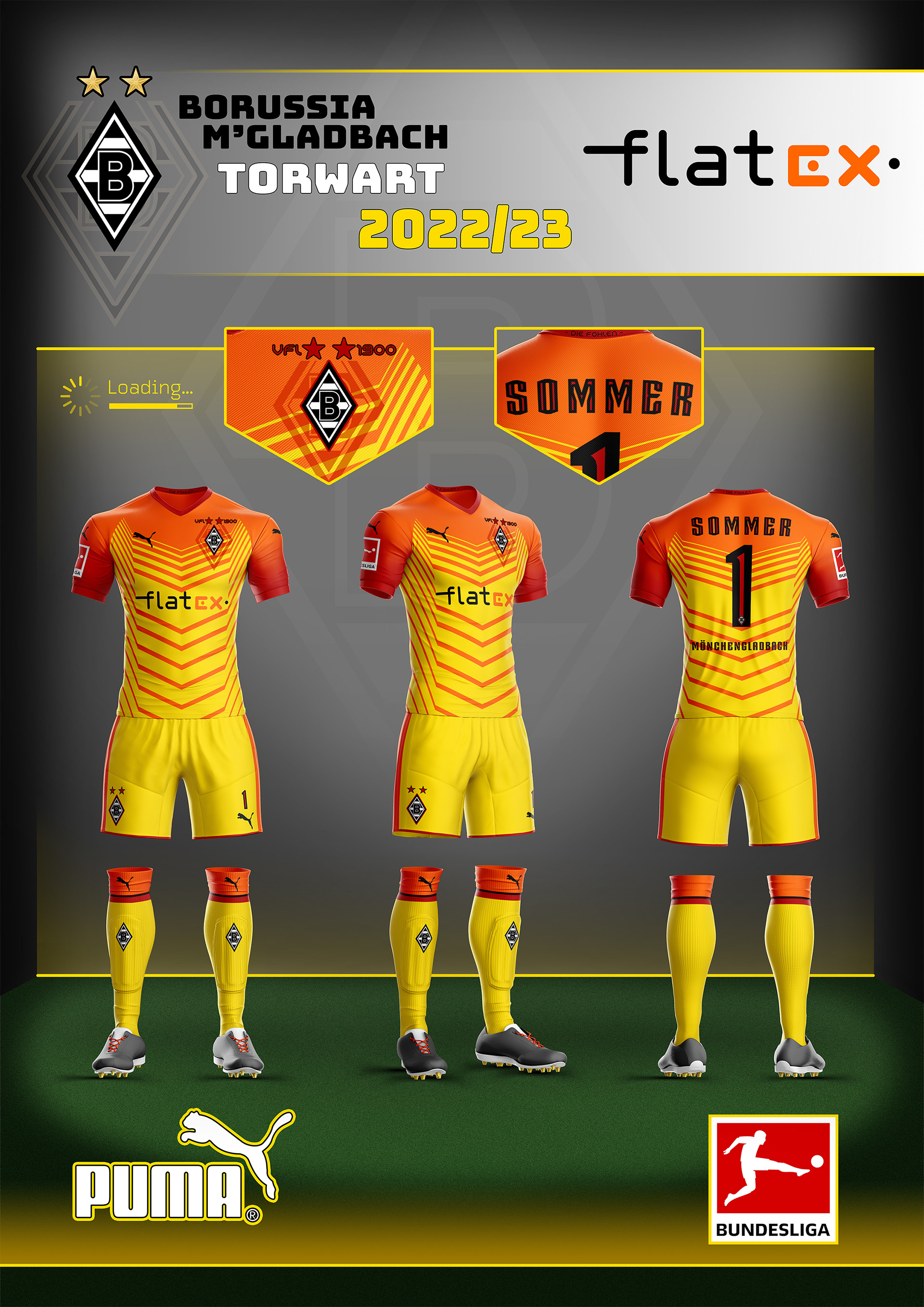
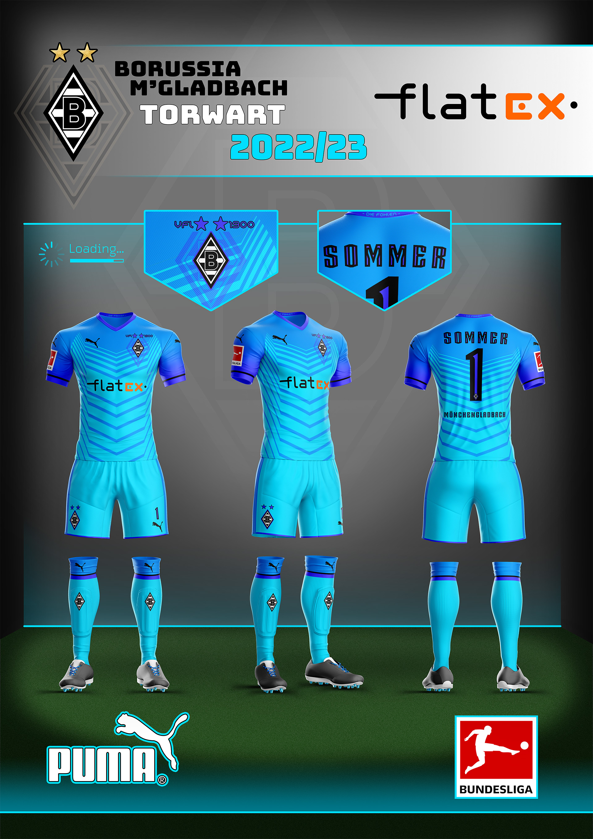
A football kit is the defining factor that separates one team from another. The supporters of a club wear them with pride, buying the newest kits year after year. This concept spans a complete set, covering all kits the team would require for a full season.


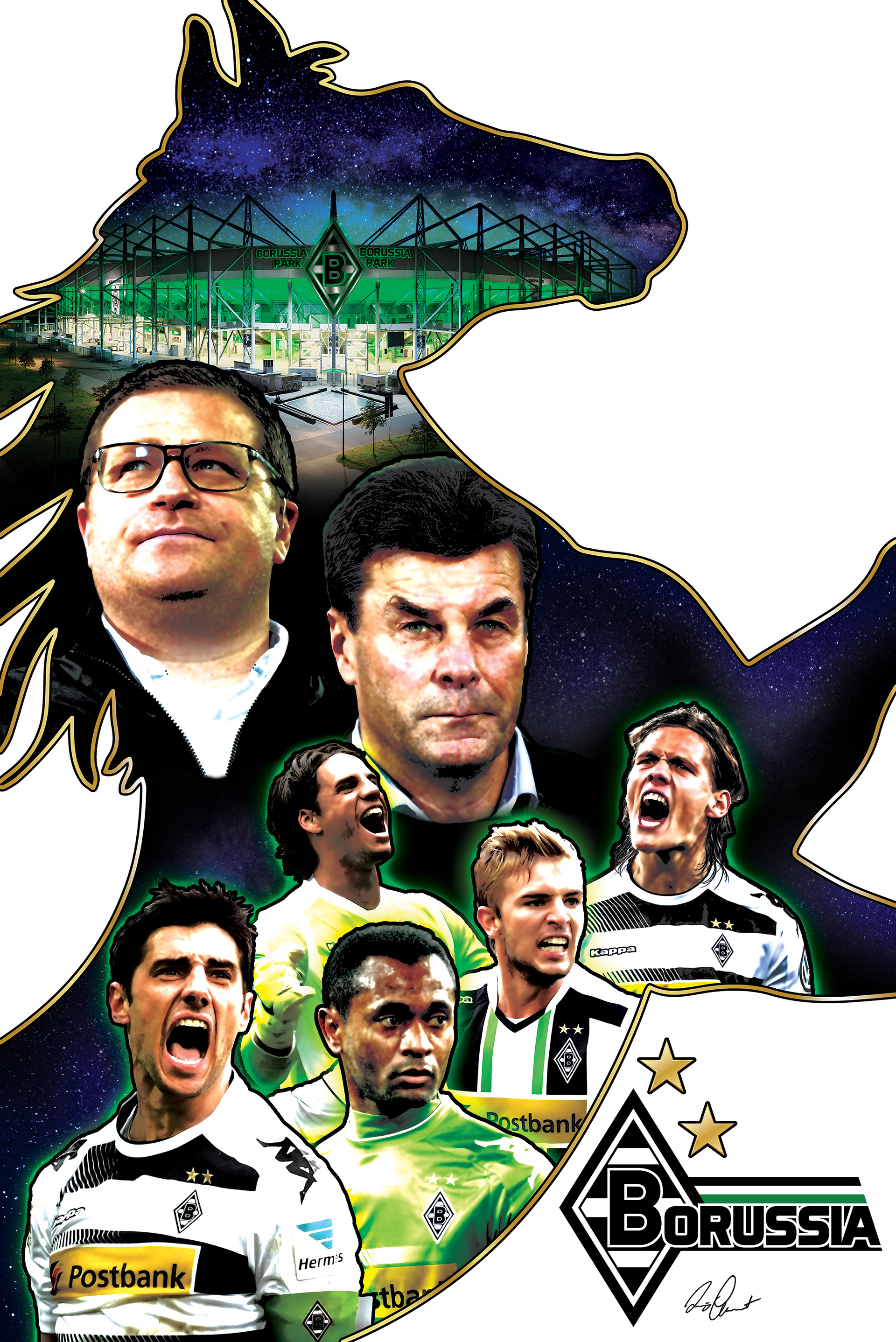
For the second concept, I created collage posters that incorporated various characteristics of the club. The stadium, team-manager, head-coach, and several of the most important players were used for the compositions, as well as implementing a more illustrative look/style. Everything was then outlined with the silhouette of a horse, a tribute to the nickname for Borussia M'Gladbach "die Fohlen" (the foals), which is also the team mascot.
The first iteration of this poster was created during the 2017/18 season, when Dieter Hecking was still head-coach for the club.
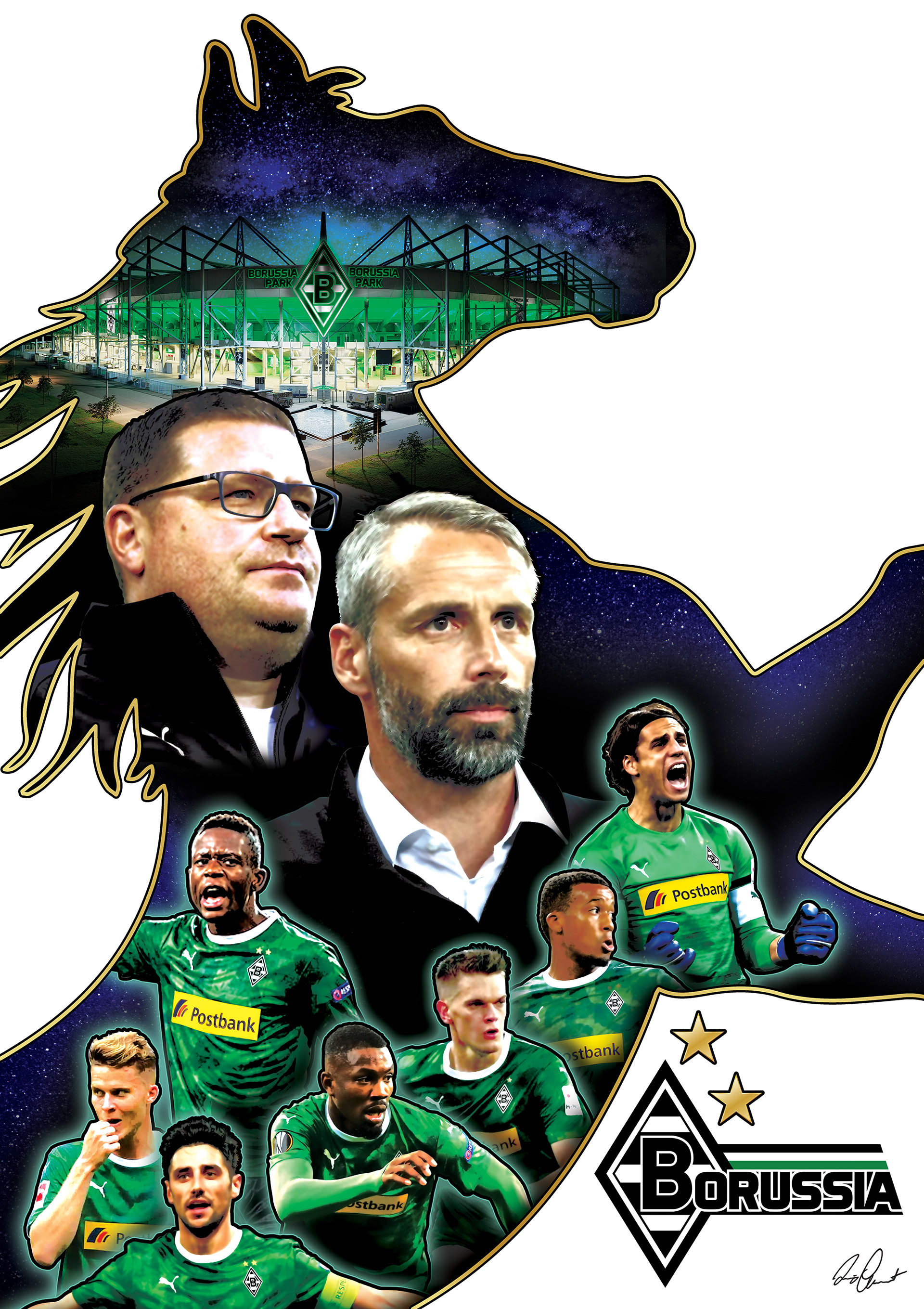
During the 2019/20 season, I decided to make an updated version of the collage, using then head-coach Marco Rose, as well as trading out any players that had left the club for more relevant players. Furthermore, I refined various aspects of the poster until it had a more polished look, compared to the first iteration. The use of one common color for the kit/jersey for instance, let the composition feel more harmonious.


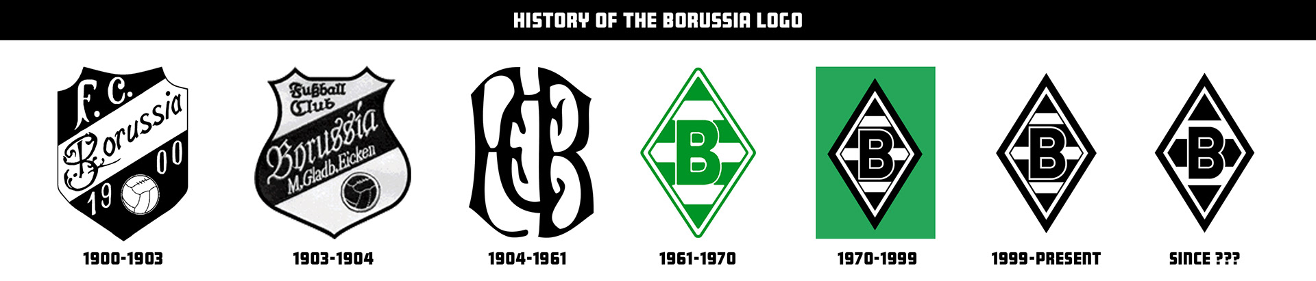
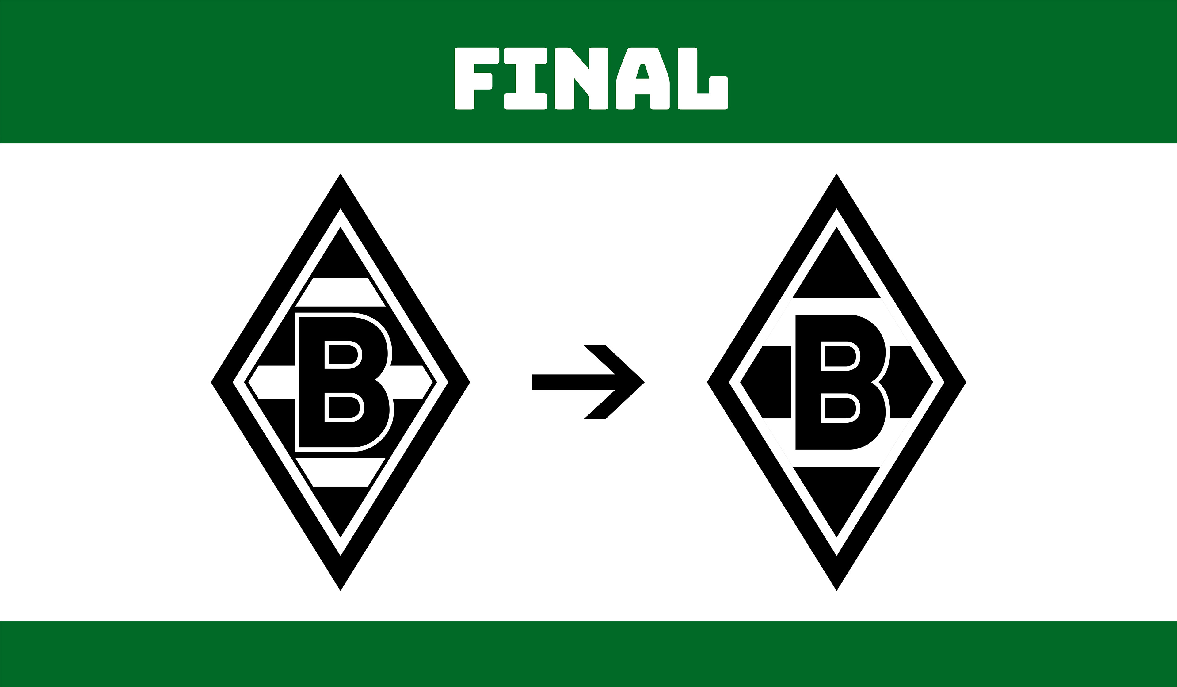
For the third and final concept, I tackled a redesign/modernization of the club's emblem.
Looking at many famous clubs around the world such as Inter Milan, Juventus Turin or Manchester City, updating a club's emblem is something that has become very popular within professional football.
Since this is a bit of a touchy subject for any die-hard traditionalist Gladbach fan, I definitely didn't want to lose the original spirit of the logo. However, the club has actually updated their logo multiple times in the past, with the current rendition being instated in 1999, therefore I felt the subject wasn't completely off the table.
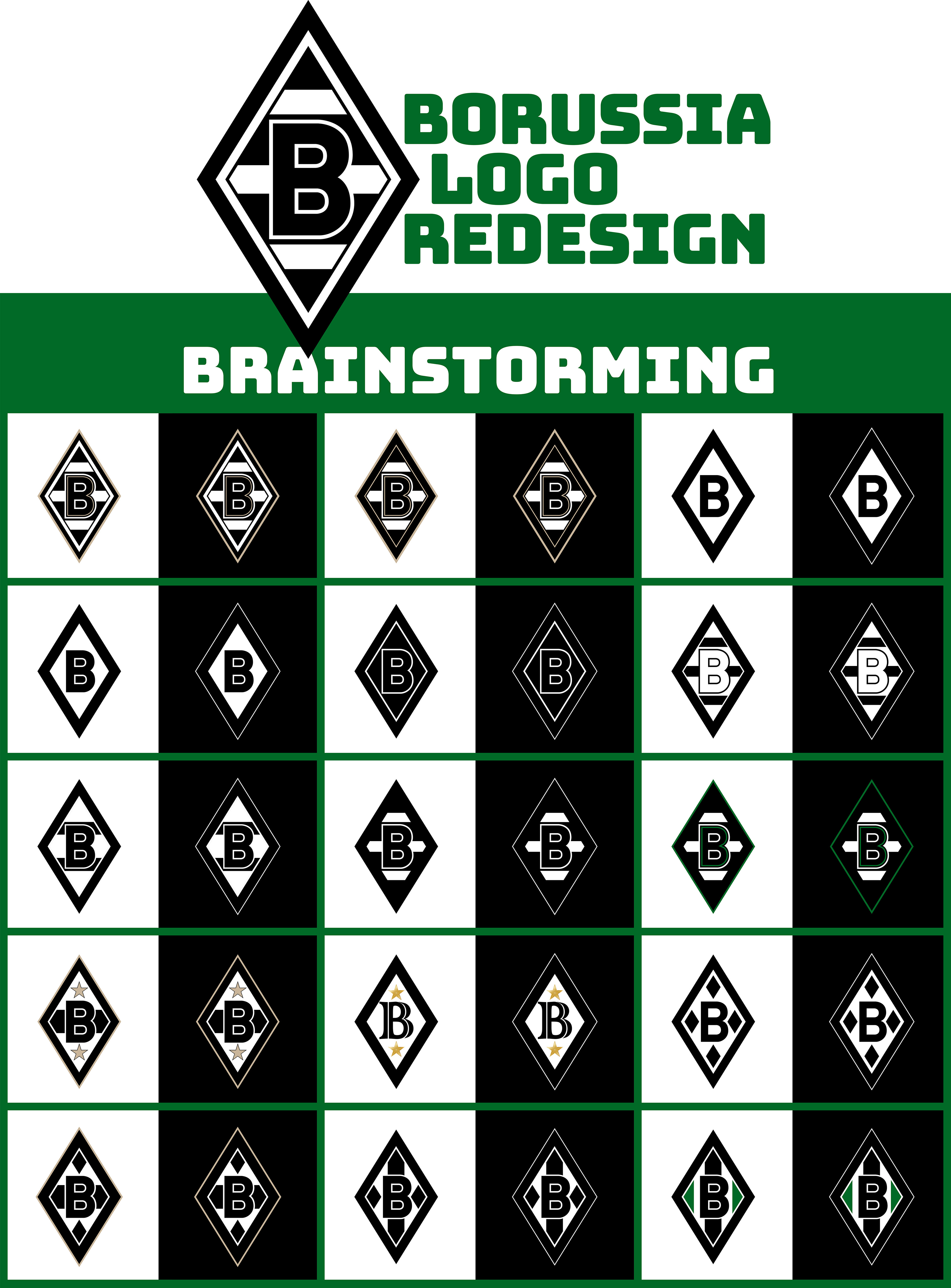
Making a new modernized rendition of the Gladbach emblem seemed like an interesting topic to delve into. I began by brainstorming various ideas, putting each on a white and black background next to each other, to get a better feel of how it would look on both background colors.
For some I used a minimalist approach, reducing as many elements as possible. I also tried placing the champion stars the club has earned within the logo for some of the variations, though this would not offer much room to win more titles in the future. Other variations reused the diamond shape of the logo, in place of the traditional striped look.
The following are all the ideas that developed during this brainstorming phase:
I ultimately decided to go a more minimalistic route, and reduce the overall number of elements within the logo. I removed one of the horizontal stripes in the background of the logo, as well as any unnecessary pin-striping used throughout the emblem, simplifying any unnecessary elements. The reductions are subtle, but give the emblem a more modern and polished look.
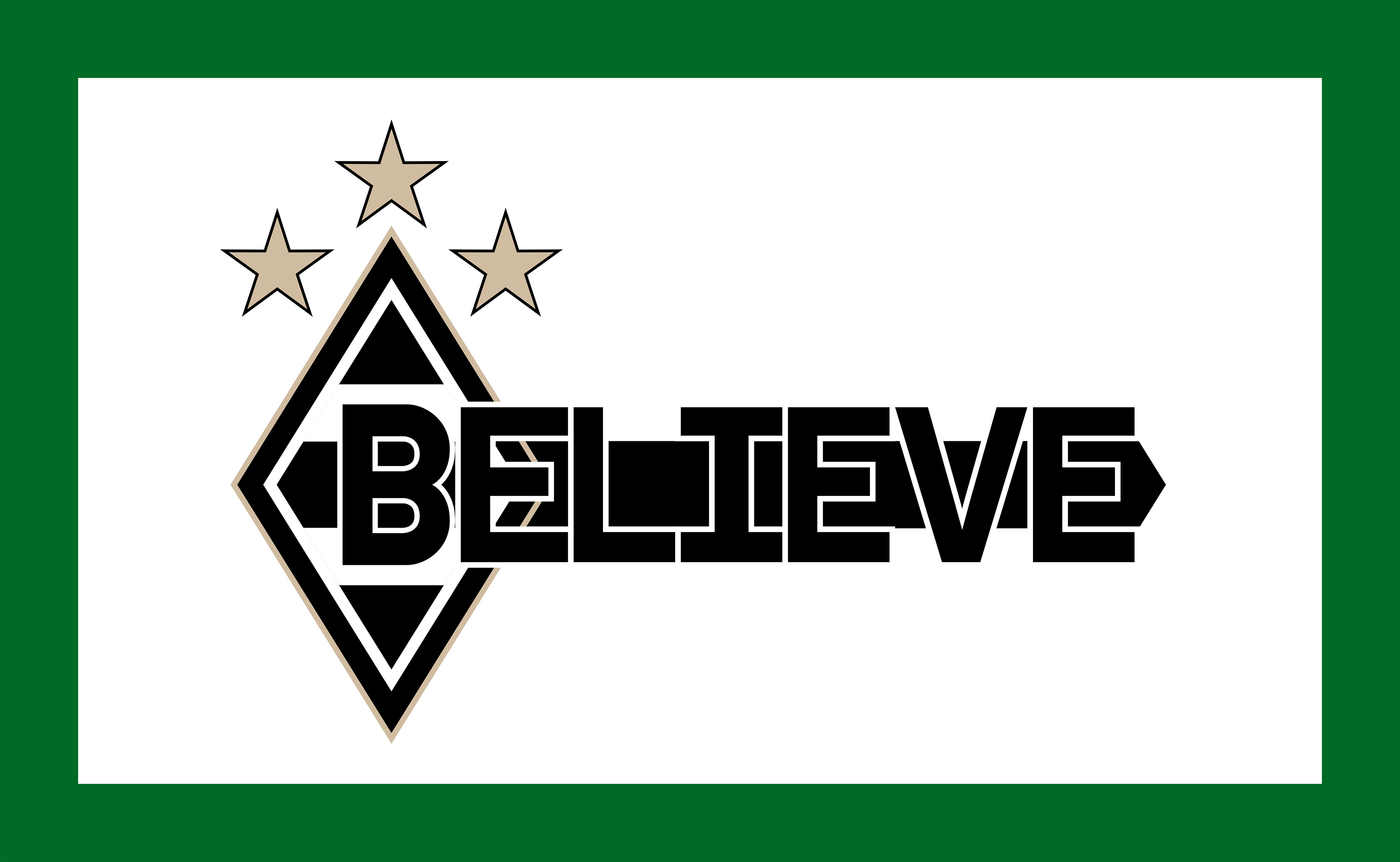
From this logo redesign, I created a campaign idea implementing three champion stars (instead of two), and the word "BELIEVE" integrated into the letter "B" that is found in the center of the logo. I gave the outer border of the logo a golden trim in the same color as the champion stars, to give it a more noble look.