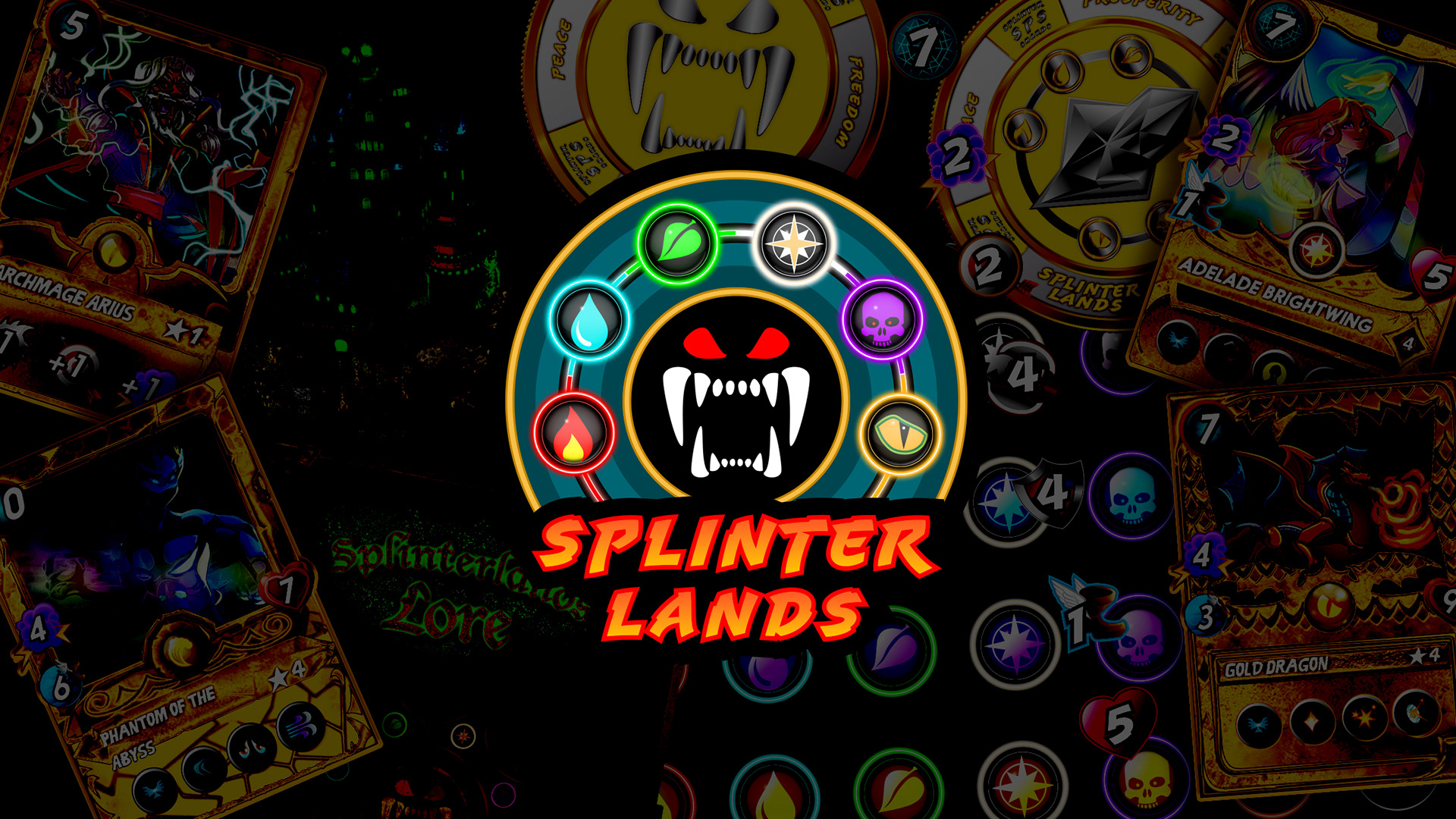
Splinterlands is a blockchain based NFT Trading card game, which I'm greatly passionate about. Within this portfolio, I tackled various things that I felt could be improved upon, as well as adding new concepts not yet existent within the game.
Link to the official Splinterlands website: https://splinterlands.com/
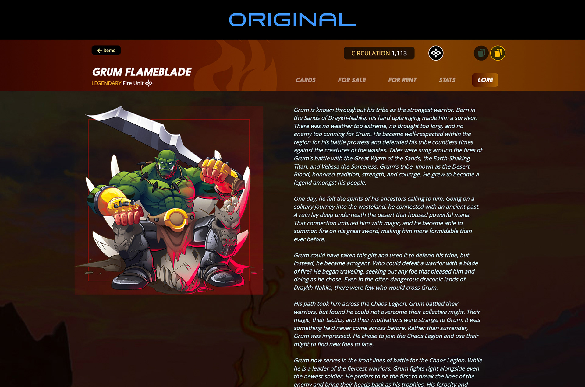
Original Artwork: Copyright © 2023 Splinterlands, all rights reserved
Original Artwork: Copyright © 2023 Splinterlands, all rights reserved


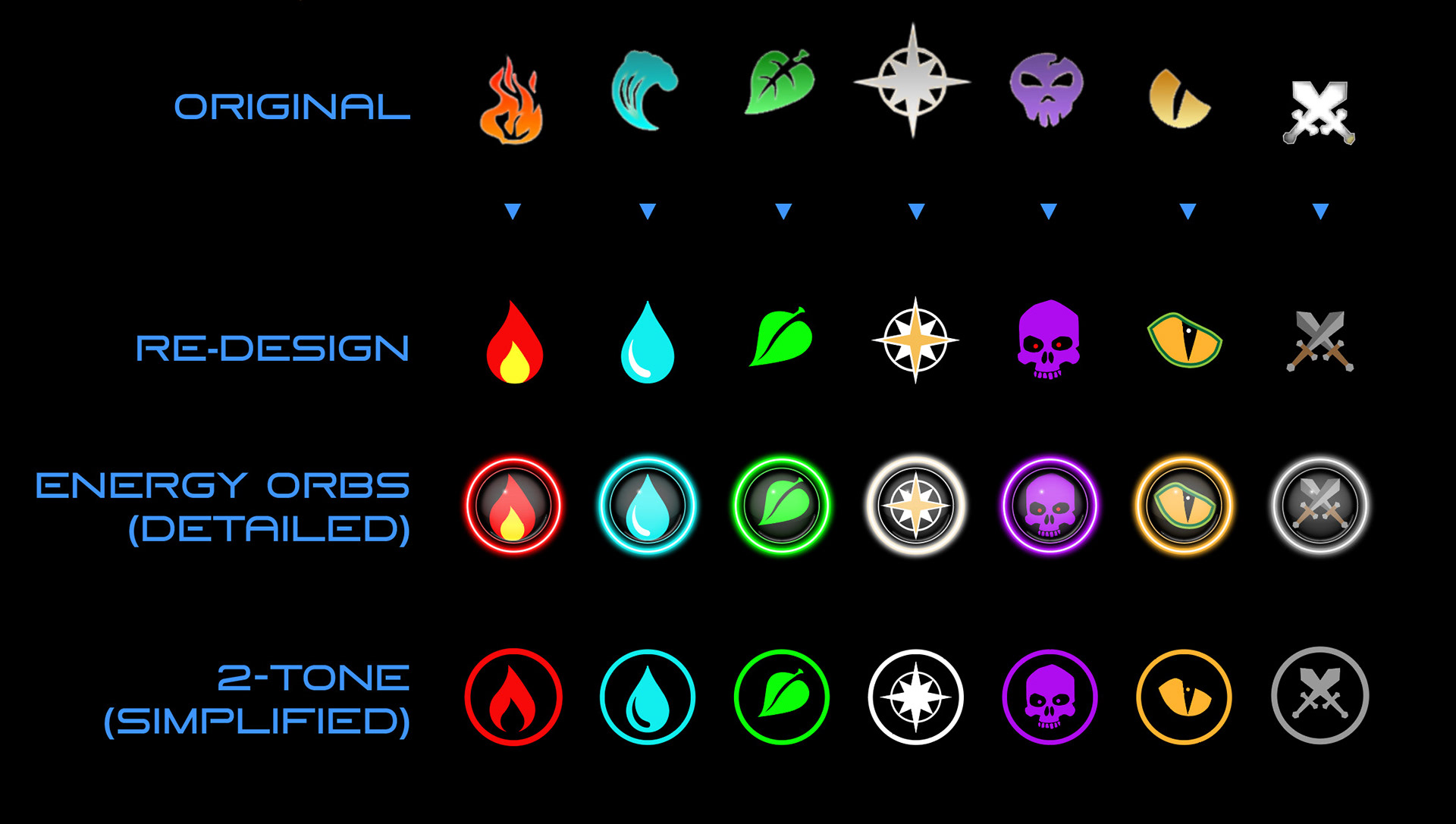
The first concept I tackled was redesigning the icons representing each splinter. I felt some of them were a little rough around the edges, while some needed just slight modifications, to get them all looking like a more polished product. Generally, I wanted the splinters to have simple two-tone icons, accompanied by a third accent colour.


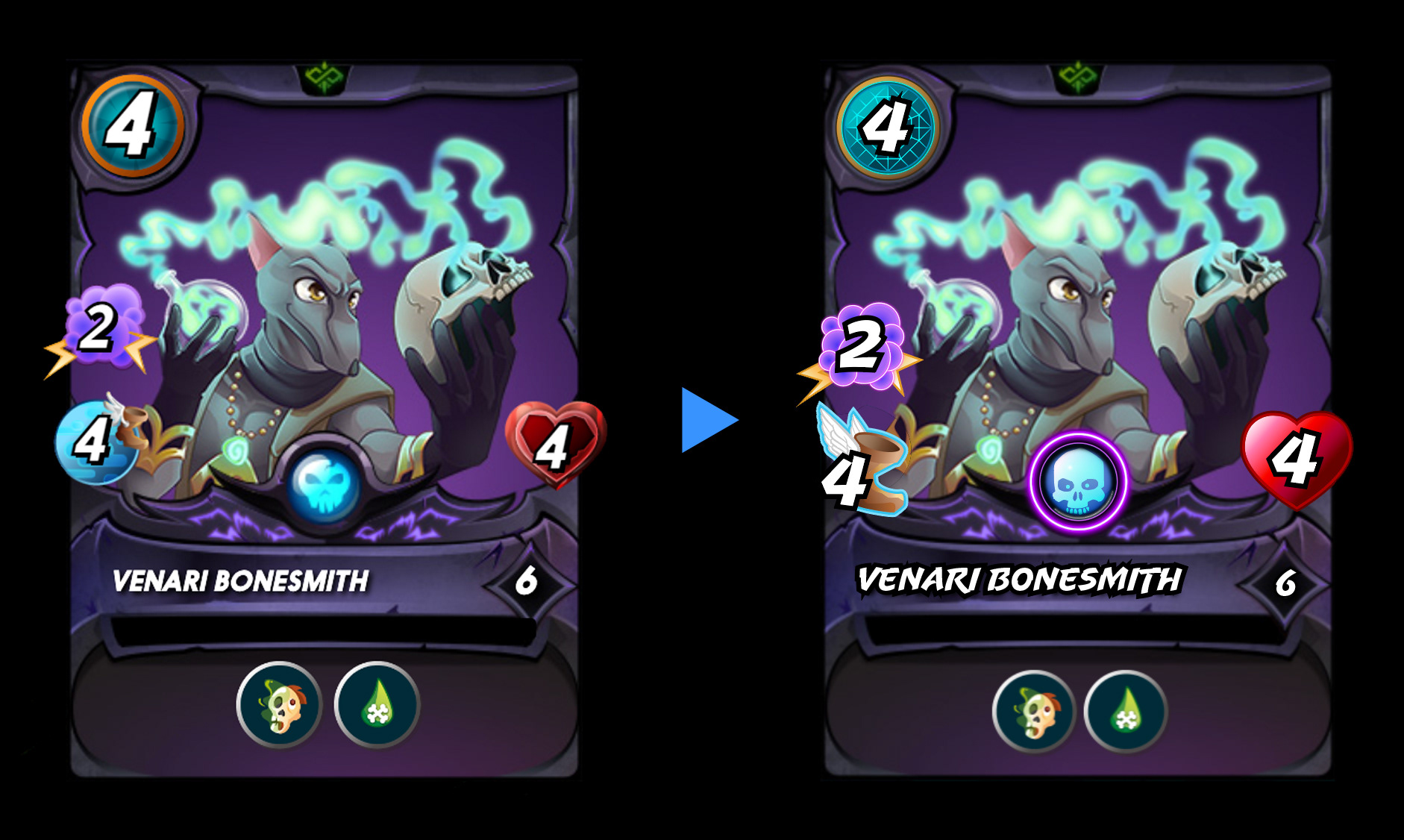
I then proceeded to update the rarity icons found in the center of each card, using the icons created in the first concept.
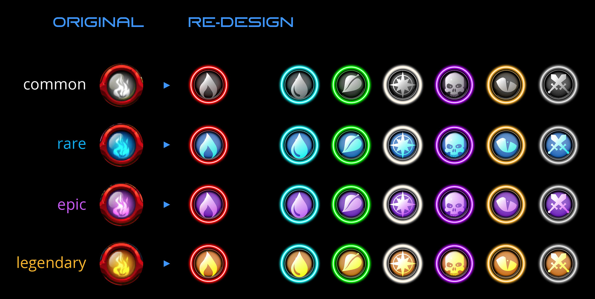
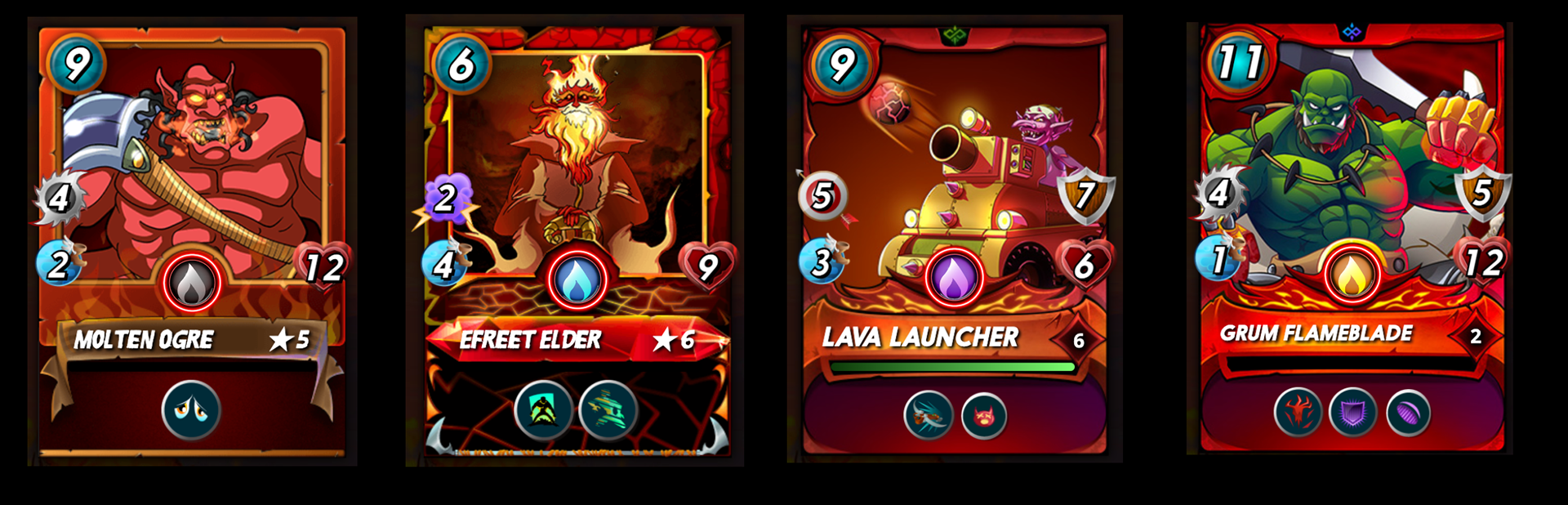
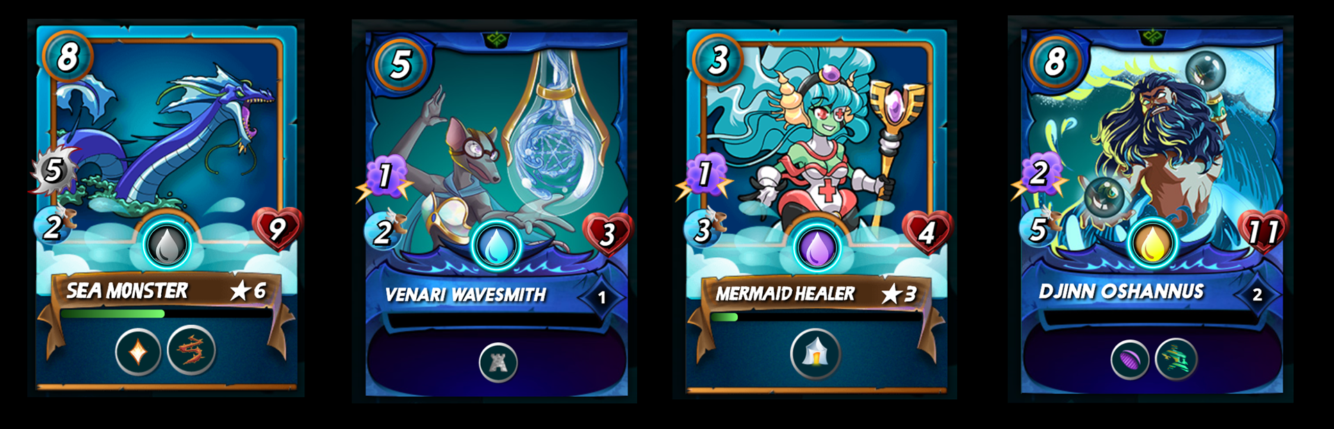
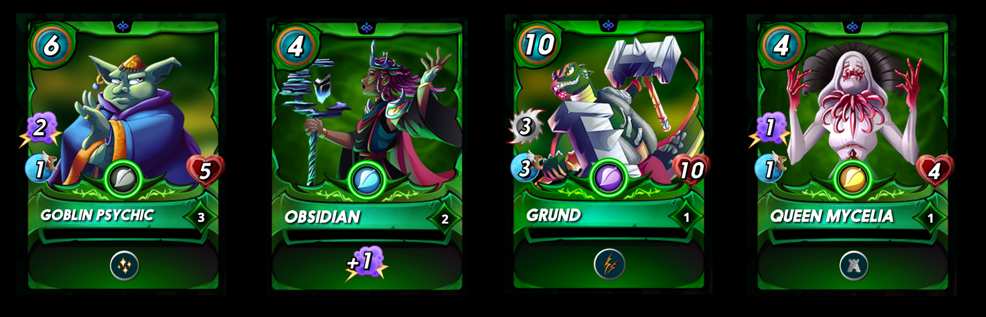
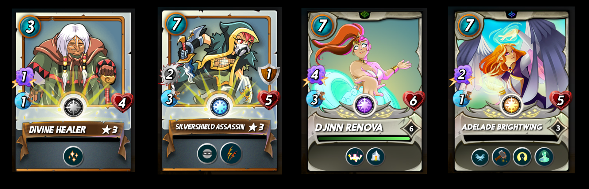
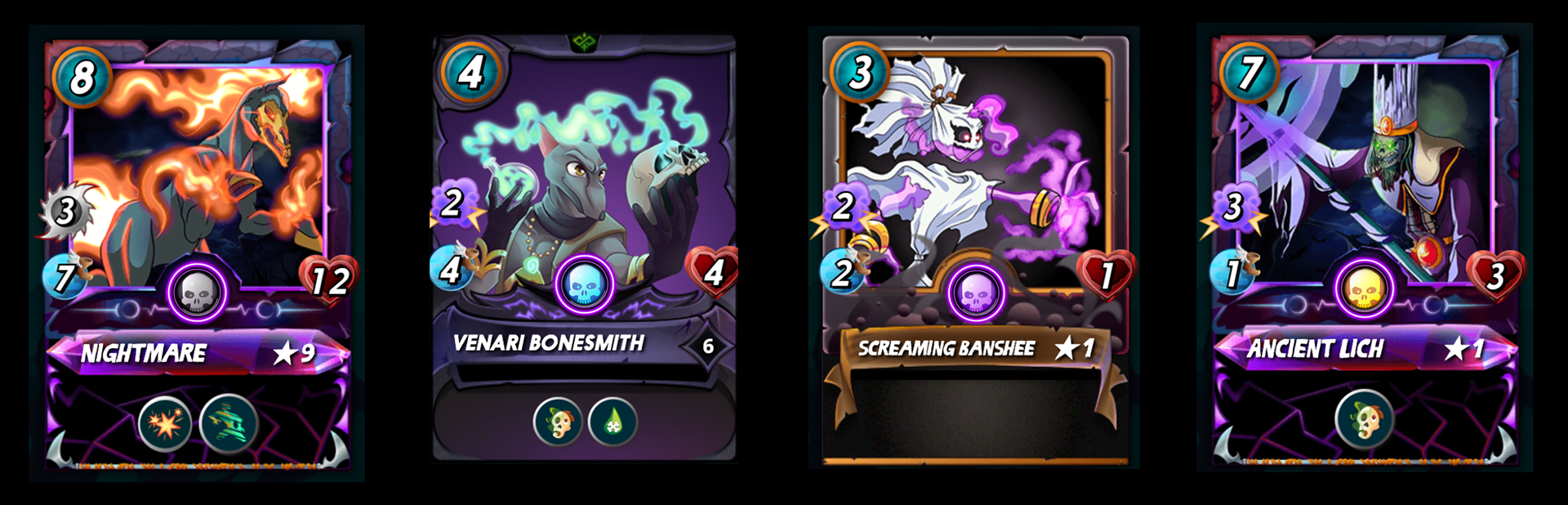
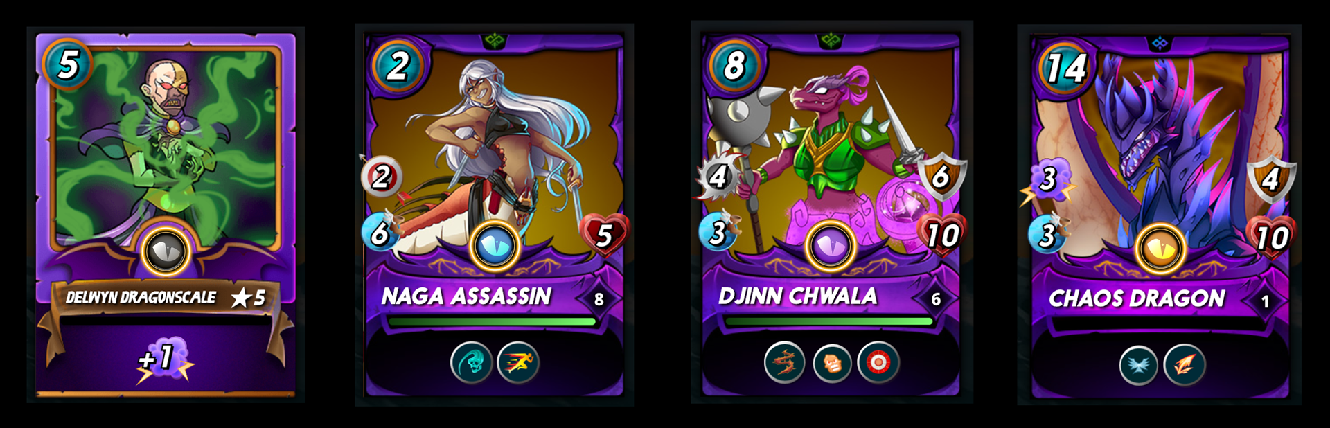
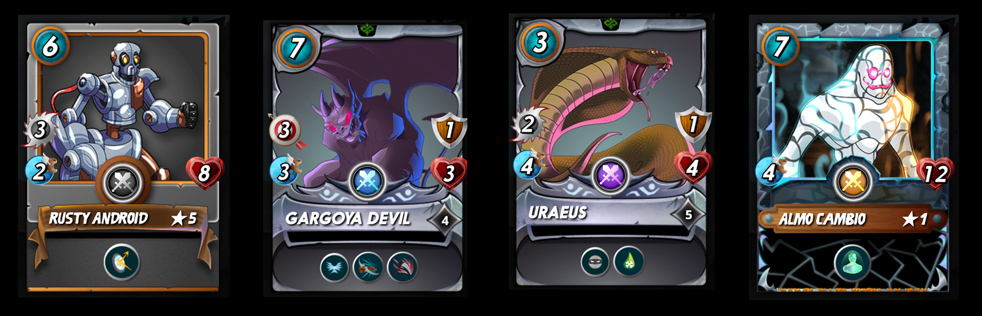
The following are mock-ups of the cards with the redesigned icons, showing what they look like for each splinter and rarity.


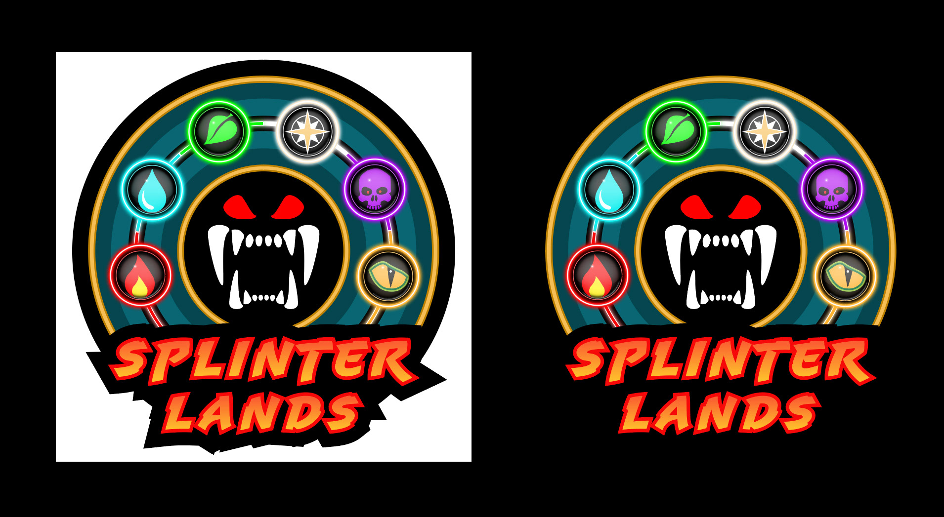
After having made the icons for each splinter, I proceeded with a redesign of the Splinterlands logo (seen in the below image). I wanted to retain the overall feel of the original, but optimize it in terms of design and proportion. I would re-use most of the colors, as well as refining the unique elements already present in the logo.
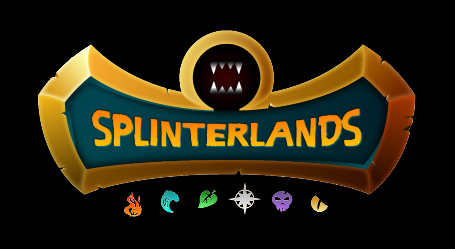
The first element I remade was the monster jaws adorning the center of the logo. This would offer me a foundation on which I could build the rest.

After that, I brought everything together with the detailed energy orbs from the first concept, and placed them on a circular base. I also overhauled the font, using vibrant colors to breath life into the new logo.


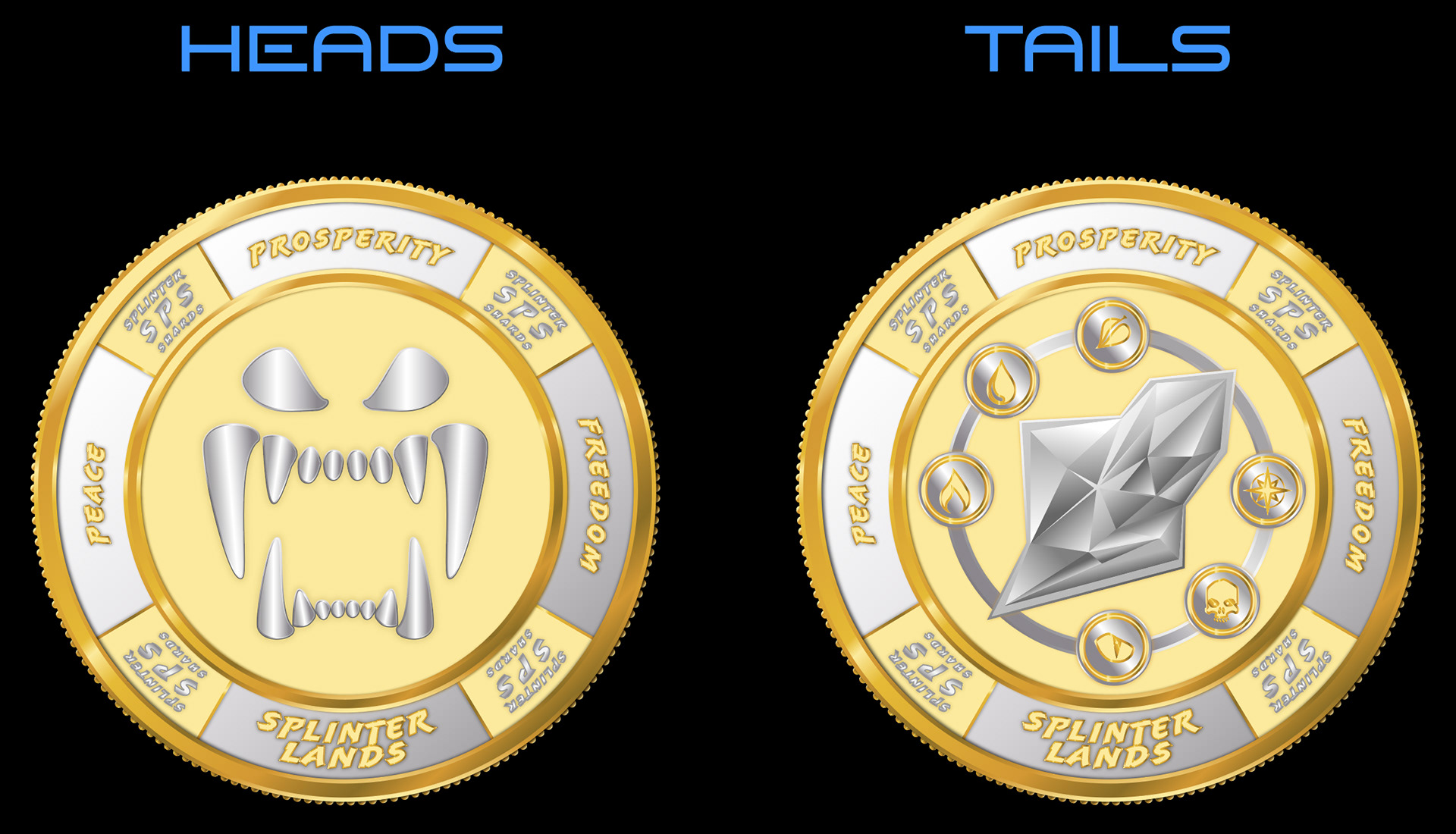
Since I had a good basis for making a token/coin from the redesign of the monster jaws, I proceeded by developing a concept for the Splinterlands native cryptocurrency token "Splintershards" (or SPS for short), using the redesigned logo from above.


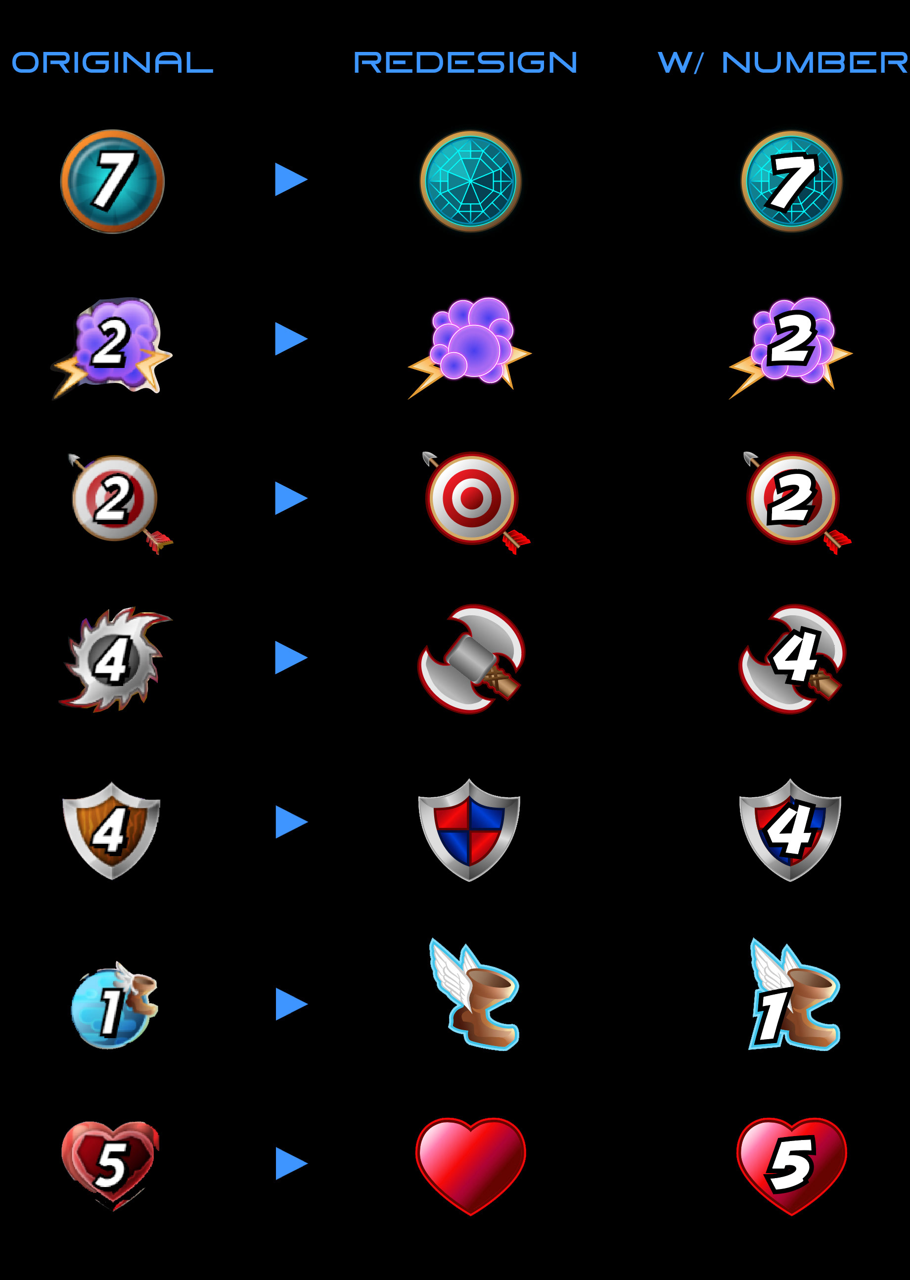
Same as the splinter icons, I redesigned the stat icons that are depicted on the cards. The goal was to develop an overall more polished and dynamic finish. To achieve this, I reused the font from the logo redesign to add more character (and solidify the branding), and once more used vibrant colors to let the icons come alive.
Using the new stat icons and updated rarity orb, I made a mock-up of the Venari Bonesmith card to show how everything fits together.


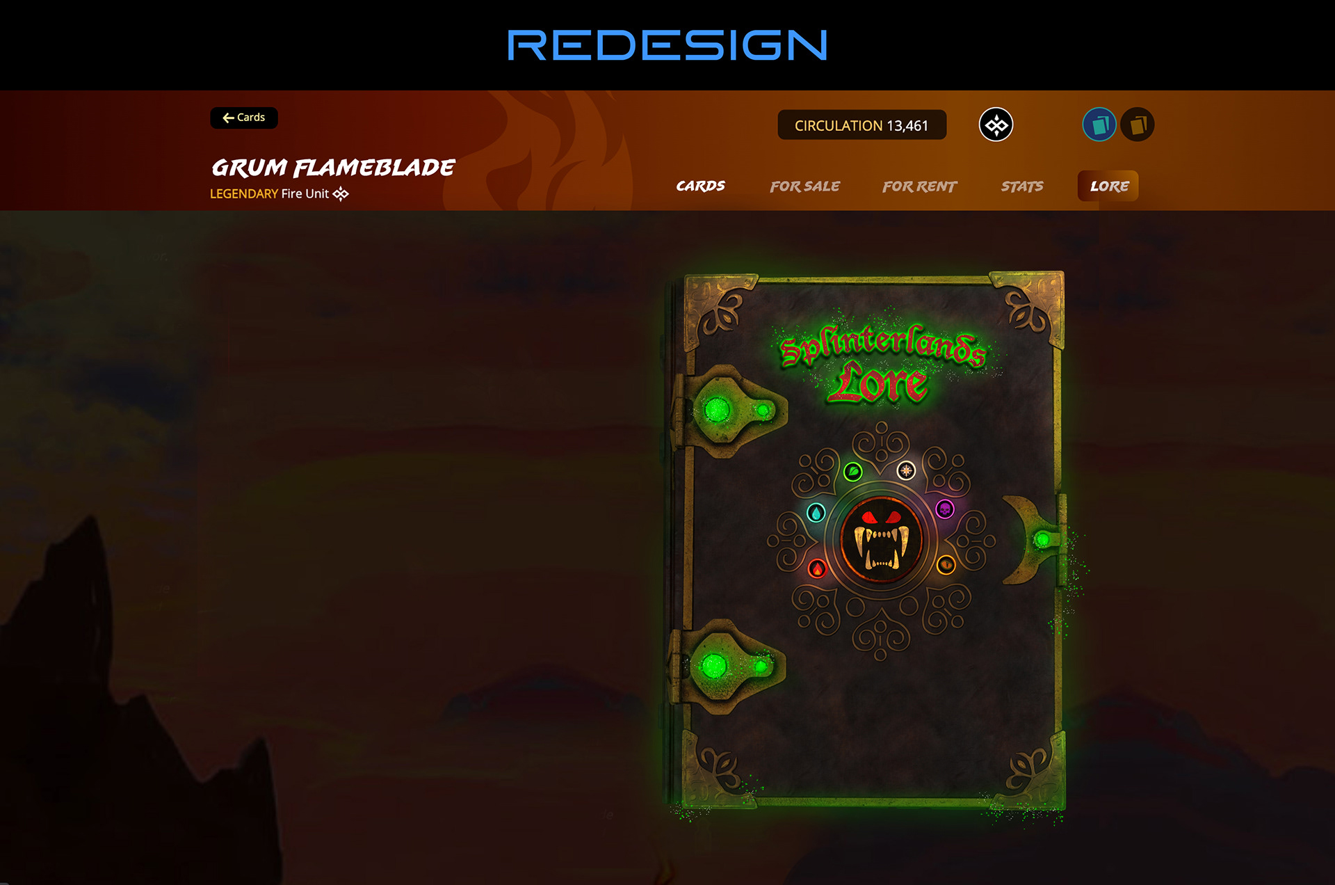
I love the Splinterlands lore! The Splinterlands team has done a great job in creating a detailed history of the magical Splinterlands realm. However, I had the idea of making the whole experience a little more special and interactive, by creating an actual book for players to flip through. All of this was underlaid with fantasy music to help immerse players even more when reading. By making the lore into a book who's pages you can flip through, the issue of players having to scroll a lot when reading long, detailed character lore was resolved.


For this concept, I wanted to tackle a topic that is still being refined by the Splinterlands developer team. I decided to let my creativity flow where it may, and came up with some live-action visualisations, that could be implemented in the land NFT release.


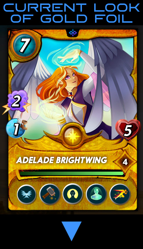
Gold foil cards are the highest value cards within a Splinterlands card pack booster, and so are the greatest prize a player can find.
The goal with this concept was to make the gold foil effect in Splinterlands look less "yellow", and to achieve a more realistic “gold” aesthetic, to underline the precious nature of the asset. In addition to that, I wanted to make the card art look holographic in nature, to accentuate the uniqueness of the gold foil cards.
For reference, the first image below is the current "yellow" look a gold foil card has in-game. The video beneath that shows the gold foil redesign implemented on a few different cards.